BACK
UI/UX Case study
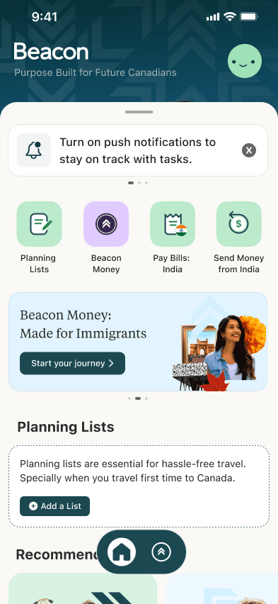
My Beacon


INTRODUCTION
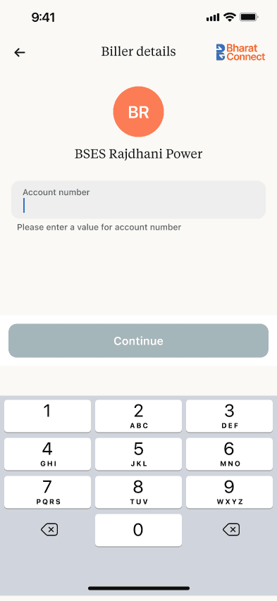
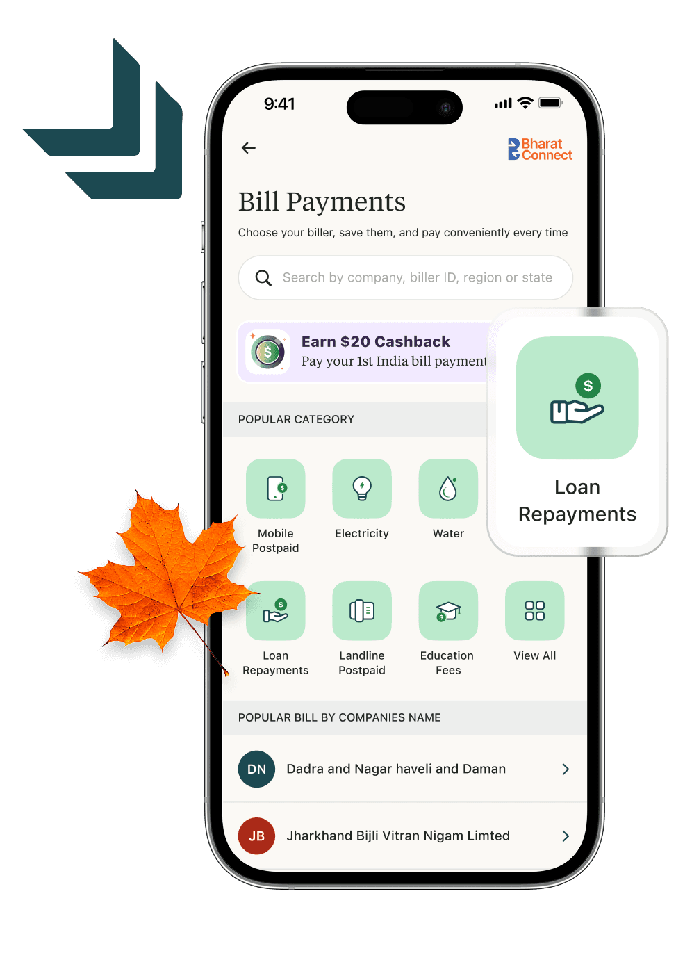
Beacon is a super app designed to help immigrants in Canada manage their finances seamlessly. It integrates essential services like money transfers, bill payments, and account management, making financial transitions smoother.
PROBLEM STATEMENT
Newcomers to Canada face challenges in accessing banking services, transferring money internationally, and managing finances back home. These obstacles create financial stress and hinder smooth settlement.
GOAL
Beacon aims to simplify financial management for immigrants by providing a user-friendly platform for seamless banking, international transfers, and bill payments, ensuring a hassle-free transition to life in Canada.


Design Process
PROJECT Timeline
Understand
User Research, User Interview, Competitve Analysis
UX Design
UI Design
Define
User Personas, Empathy Map, User Journey
Ideate
User flow, Information Architecture
Design
Wireframe, HI-Fi Design, Prototype
Test
Feedbacks, Conclusion, Future Concept
Information Architecture


High Fidelity
High Fidelity
The app is designed in minimalistic, clean and intuitive style, we took consideration of users of different ages and paid big attention to accessibility .


Enter the app
Easy and secure autorization
Security is a key in developing bank application.
By entering the app each time user to use speacial code.
To make the process easier there is an option to use FaceID/Touch ID

Fetch your loan
Card Screen
Every card has individual bright design, so that
user can easily keep it in mind. Swipe cards
function attracts user by interactions

Features
Status Screen
All frequently used features, cards and
products in one screen
Cards/ products sections can be
expanded or collapsed
User can open new card/product
directly from status screen
